Flashback: When fish, colors and 3D look dominated the world!

Management Summary:
The Frutiger Aero trend back then
Blossoming hype for Frutiger Aero
amce studios' assessment and thoughts on the trend
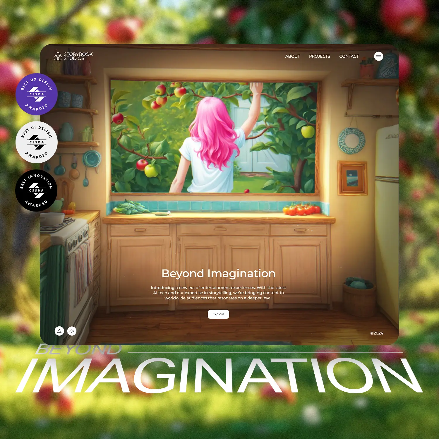
Do you remember a time when our world was characterized by the diverse and cheerful aesthetics of "Frutiger Aero"? For almost an entire decade, this design dominated all areas. The term "Frutiger" refers to the font that was widely used at the time, while "Aero" refers to the Windows Aero interface, which was considered the standard for Windows operating systems. Fish, bubbles, vibrant colors and a shiny 3D look were omnipresent.
The rich colors gave the world a lively atmosphere, especially known through the legendary Windows XP background "Bliss". Aqua elements such as soap bubbles, fish and dolphins were trendy and created the impression that technology and nature were merging harmoniously. App icons were presented in a trendy 3D look, with glossy textures and rounded corners as well as the shiny "glass boxes" of Windows. At the time, skeuomorphism attempted to depict the digital world as realistically as possible - for example, the YouTube icon was still an old television.
The Frutiger Aero aesthetic was everywhere: from technology, logos and advertisements to magazines and interior design. But why is the younger generation in particular experiencing a renewed hype around this 2000s aesthetic? The answer probably lies in the cheerfulness of days gone by. Everything was presented in a positive, colorful and shiny way. Does the futurism that manifests itself in designs from back then still seem contemporary and futuristic today? Yalda Jaililvand, Art Director at amce studios GmbH, says: "I first saw this kind of design as a child, seeing glass and transparent elements in design was cool and very new then. But it was nice for back then when doing things like this was difficult. In an age like this where people can create literally anything, going back to that just says: we need more experts in design."
About Frutiger Aero
Frutiger Aero is a design movement that emerged in the 2000s and is currently being rediscovered by Generation Z. This movement is closely linked to iconic technological developments such as Windows Vista, the first iPhone and the Nintendo Wii. It is characterized by a combination of sleek and modern elements, natural images and fresh colors. Frutiger Aero is a type of design that can be considered a subgenre of skeuomorphic design, as it incorporates 3D realism elements into its aesthetic. It was a broad design style and aesthetic phenomenon that was widely used in advertising, media, stock imagery and technology from around 2004 to 2013, marking the end of the Y2K era.
Share this article.


amce studios GmbH is an owner-managed digital agency based in Darmstadt. Since its founding, its customers have included large and medium-sized companies, up-and-coming start-ups and ambitious new entrepreneurs from the technology, energy, environment, retail and fashion sectors. As a full-service agency, customers are supported regionally, nationally and worldwide in all areas of web experience, branding, social media and 3D design. amce studios GmbH is part of the amce studios group.